How would you feel if you painted all of the walls in your home black? Have you ever had a teacher hand back your homework covered in red ink? Think about it, beyond consumer behaviour we know that colours play a vital role in communicating our thoughts and feelings towards something. By further understanding the thoughts and feelings associated with certain colours and colour-combinations, we can better understand how the impact of colour can transform how businesses engage with consumers and visa versa. Boldog here to take you into the fascinating world of colour psychology and its profound effect on consumer behaviour.
What is Colour Psychology?
Colour psychology delves into how different hues, shades, and tones affect human emotions and behaviour. It’s not just about what looks good; it’s about how colours make us feel and react. For businesses, leveraging the right colours can enhance brand perception, evoke desired emotions, and ultimately drive consumer action.

Why Colour Matters in Marketing
Colour is a powerful tool in marketing. Research shows that up to 90% of a consumer’s initial impression is based on colour alone, and 85% of purchasing decisions are influenced by colour.
Here’s how different colours can impact consumer behaviour:
Blue
Trust and Dependability
Blue is a favourite among many, often associated with trust, loyalty, and calm. It’s no surprise that brands like Facebook, Dell, HP, Visa, and WordPress use blue to project reliability and security. However, blue can also be seen as cold or unappetizing, which is why you won’t find many food brands using blue in their packaging.
Red
Energy and Urgency
Red is a powerful colour that evokes strong emotions like passion, energy, and excitement. It’s widely used in sales and promotions to create a sense of urgency. Fast-food chains like McDonald’s combine red with yellow to stimulate appetite and convey happiness.
Green
Health and Prosperity
Green, reminiscent of nature, symbolizes health, growth, and prosperity. It’s often used by brands promoting eco-friendliness or health, such as Whole Foods. However, green can sometimes feel stagnant or boring, so it’s crucial to balance it with other colours to maintain interest.
Yellow
Optimism and Warmth
Yellow is the colour of sunshine and smiles, associated with optimism, warmth, and creativity. Brands like IKEA use yellow to convey a friendly, cheerful image. But beware — too much yellow can lead to feelings of anxiety or frustration.
Black
Sophistication and Power
Black exudes elegance, sophistication, and authority. Luxury brands like Chanel and high-tech companies often use black to convey a sense of exclusivity and power. On the downside, black can also feel oppressive or menacing if not used thoughtfully.
Purple
Luxury and Imagination
Historically associated with royalty, purple signifies luxury, wisdom, and imagination. Brands like Hallmark use purple to appeal to a sense of sophistication and specialness. Yet, overuse of purple can come off as overly decadent or moody.

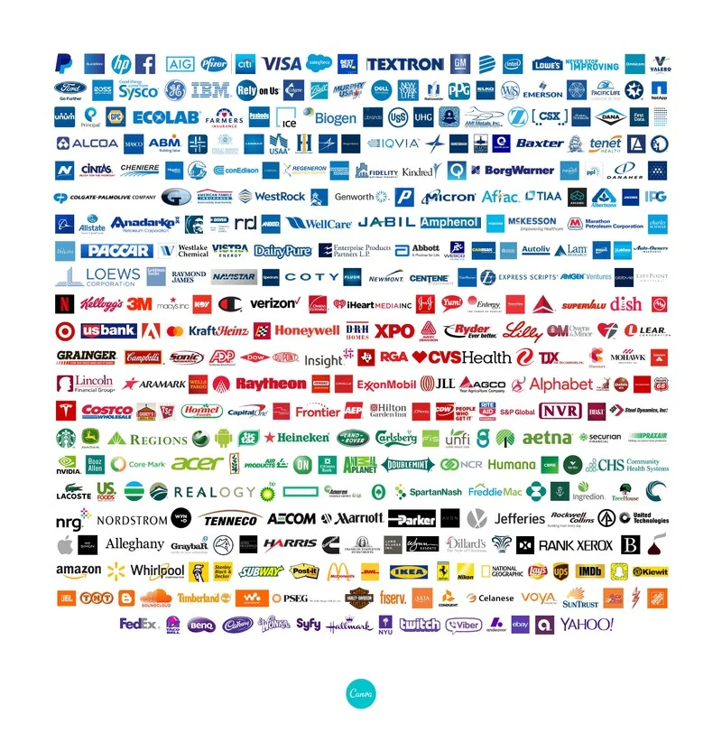
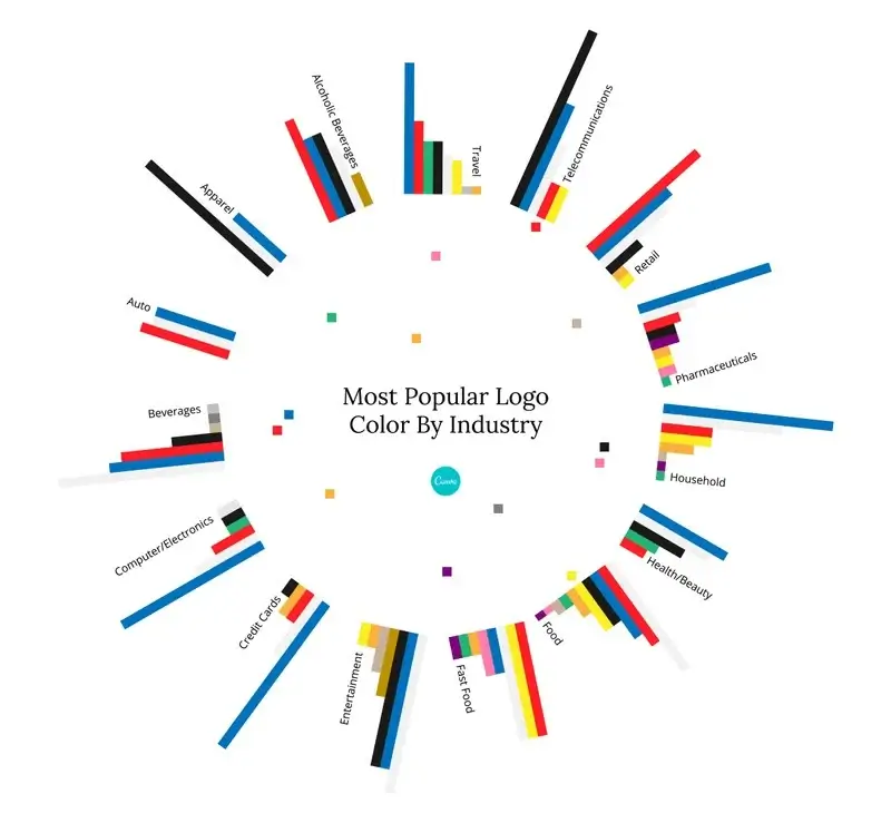
It’s worth noting: Blue is the most popular colour used by Fortune 500 Companies.
The Neuroscience Behind Colour Perception
The science of how we perceive colour is as fascinating as its effects. When light enters our eyes, it’s absorbed by photoreceptors in the retina — rods for light and dark, and cones for colour. These signals are sent to the brain’s visual cortex, which interprets the colours we see.
Interestingly, our brains don’t just see colours; they assign emotions and meanings to them. This interpretation is influenced by cultural contexts and personal experiences. For instance, in Western cultures, black might signify mourning, while in some Eastern cultures, it represents elegance and power.
Colour in Branding and Design
Strategic use of colour in branding can significantly enhance a brand’s identity and appeal. For instance, Apple’s minimalist white logo conveys simplicity and innovation, while Nike’s black swoosh emphasizes power and performance. Understanding colour psychology helps businesses create an emotional connection with their audience, making their brand more memorable and impactful.
Practical Tips for Using Colour in Marketing
- Know Your Audience: Different colours evoke different responses based on cultural and personal preferences. Understand your target audience’s associations with colours.
- Consistency is Key: Maintain consistent use of colours across all branding materials to reinforce brand identity and recognition.
- Balance and Contrast: Use contrasting colours to highlight important elements and create visual interest without overwhelming the viewer.
- Test and Adapt: Continuously test your colour choices and adapt based on consumer feedback and engagement metrics.
In Conclusion
Colour is not just a visual experience but a powerful psychological tool that can shape consumer behaviour. By understanding and leveraging colour psychology, businesses can create compelling, emotionally resonant brand experiences that drive consumer action.
At Boldog Digital, we’re passionate about helping businesses at all stages create impactful marketing strategies. Whether you’re rebranding or launching a new campaign, let us help you create a colourful campaign to connect with your audience and achieve your goals. Unless your brand is black. Then no colour.
Resources:
https://www.canva.com/logos/color-psychology-the-logo-color-tricks-used-by-top-companies
https://blog.hubspot.com/the-hustle/psychology-of-color
https://99designs.com/blog/tips/how-color-impacts-emotions-and-behaviors


